 1
1These samples are displayed on an A2 sheet of card.
I originally went to photograph some wooden angels, high up near the ceiling, in Cilcain church. Unfortunately, my camera zoom couldn't cope so my husband took the photographs instead.
Whilst waiting for the church to be unlocked, I looked round the churchyard and found a row of very old gravestones which had been laid down horizontally. The carving was very weathered but water had settled in the indentations - and mossy letters and patterns had grown.
What an unexpected bonus this was! Even though it was a bitterly cold day and my feet were frozen through walking on the wet grass, I looked for a long time at the stones and took quite a lot of photographs. I thought that it was quite touching that these names which were practically eroded away (and whose owners were long forgotten), were now re-emerging in moss.
 2
2It was possible to read quite a lot of the text, although other parts were quite indistinct.
 3
3I tried several different methods of reproducing this effect.
 4
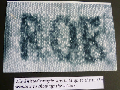
4I originally drew out a chart for 'Robert' which was the name on one of the graves. Then I decided to shorten it to 'Rob', as the process was quite time consuming. The letters were knitted in two strands of boucle, which kept trying their best to tangle together.
 5
5 6
6This design was surprisingly clear and detailed. I was fascinated by it. I do hope that nobody scrapes it off, as the text will probably be illegible then.
 7
7This yarn looks a bit 'mossy' anyway, as I spun coils into it. I did wind a few more curls into it as I stitched it down.
 8
8I normally prefer machine embroidery to hand stitching but strangely, this was quite therapeutic to do. I can't believe I just wrote that! I must be suffering from lack of chocolate.
 9
9I used this stitch years ago, round the brim of a baby hat (but with thicker needles). I always knew that it would come in useful again.
 10
10It turned out to be very lucky for me that I love spinning very textured yarns.
 11
11Here, I revisited the dried ivy stems which I touched on in my sketchbook.
 12
12 13
13 14
14More horizontal gravestones. The text had completely disappeared on these but I liked the way that they are still emphasized by the moss and short grass growing over them.
 15
15Not handspun this time. Shame on me! It just goes to show though, that it pays to be a hoarder!
 1
1 2
2 3
3 4
4 5
5 6
6 7
7 8
8


