1
1I enjoyed this activity and decided to continue it using different types of pictures and colour combinations. This is one of my favourite colour investigations in this chapter. I like the strong contrast between the lights and darks and the mysterious, moody palette of colours.
 2
2 3
3I liked the gentle blues, lilacs, peaches and greens in the left hand picture.
I'd probably prefer the right hand colour scheme with the addition of more blues and oranges and more contrast. As it is, it looks a bit bland.
 4
4I was pleased with the results of this activity and I think that the dyed fabric colours turned out to be a good match to the photograph.
 5
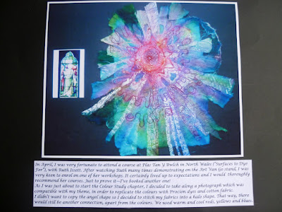
5These colour swatches are displayed on two sheets of A2 card. The coloured squares seemed to get everywhere, especially after I put a book down too quickly and sent them all into orbit!
 6
6 7
7 8
8Considering how many colour circles I've done in the past, this took longer than I expected. Perhaps that means that it was high time I did another one! Once again, I painted a lot of test samples before filling in the sections.
I quite enjoyed making some samples with foodstuffs and make up and was tempted to do more. In the end, I decided to carry it over to the dyeing chapter instead.
 9
9It was quite a nice change to work with a different colour palette!
I really love this colour scheme, especially after the addition of more darker samples (in colour study 2). The warm oranges, reds and golds are exciting when combined with the purples and plums.