I recently attended an excellent course called 'Textured
Surfaces for Stitch', with Carol McFee. She and Lynda Monk
wrote the book, 'Stitching The Textured Surface', which I
have in my hoard.
We used texture pastes and gels to create interesting surfaces
on a variety of backgrounds. Carol then demonstrated her
colouring methods, which give lovely, iridescent effects.
I don't want to give away too many details about the course, in fairness to Carol.
I would certainly recommend anyone who has the opportunity
to go on this course. I came away with my head buzzing with ideas.
Carol and Lynda have some free tutorials on their website at
www.fibreinform.com
 1
1A lot of these effects were quite ethereal and I could see them
being very useful for my theme, 'Churches, Chapels and Churchyards'.
Number 1 could convey the misty, eroded designs on some of
the gravestones I've seen.
 2
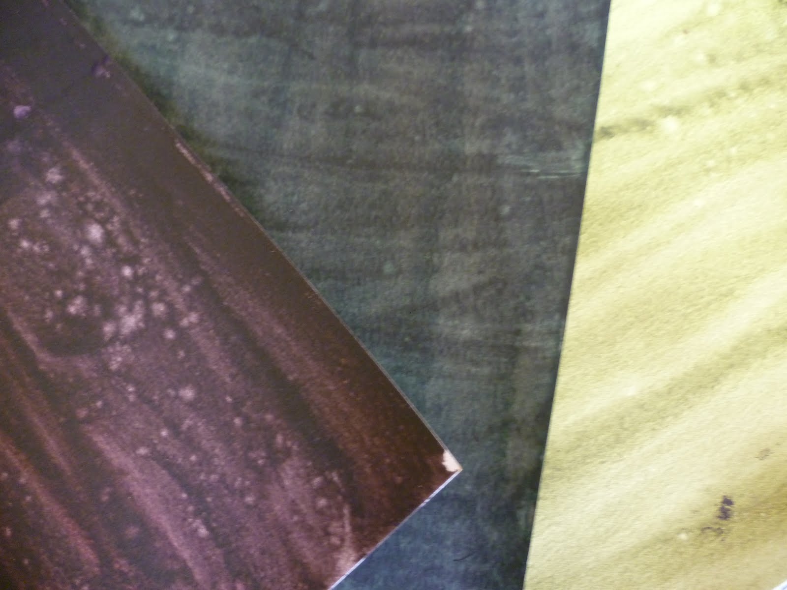
2Although we used mainly commercial stencils, I'd like to cut
my own to link in with my theme.
 3
3Some of the materials we used absorbed the colour and
others acted as resists. Using them both in the same piece
would give even more scope for experimentation.
 4
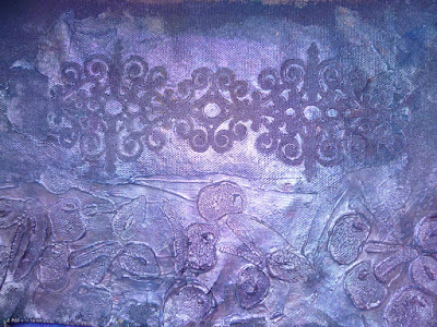
4As you can see, some of the colouring materials were very shiny.
The seahorses in this sample remind me of carved wood - another useful effect!
 5
5 6
6This surface suggests weathering and decay.
Again, that would fit in perfectly with my theme.
 7
7As I leave early for the Urchfont Summer School tomorrow,
I'm not going to be able to follow up these techniques until I get back.
Doubtless, I'll come back with my head full of bees again.
HOWEVER WILL I SLEEP TONIGHT?
 1
1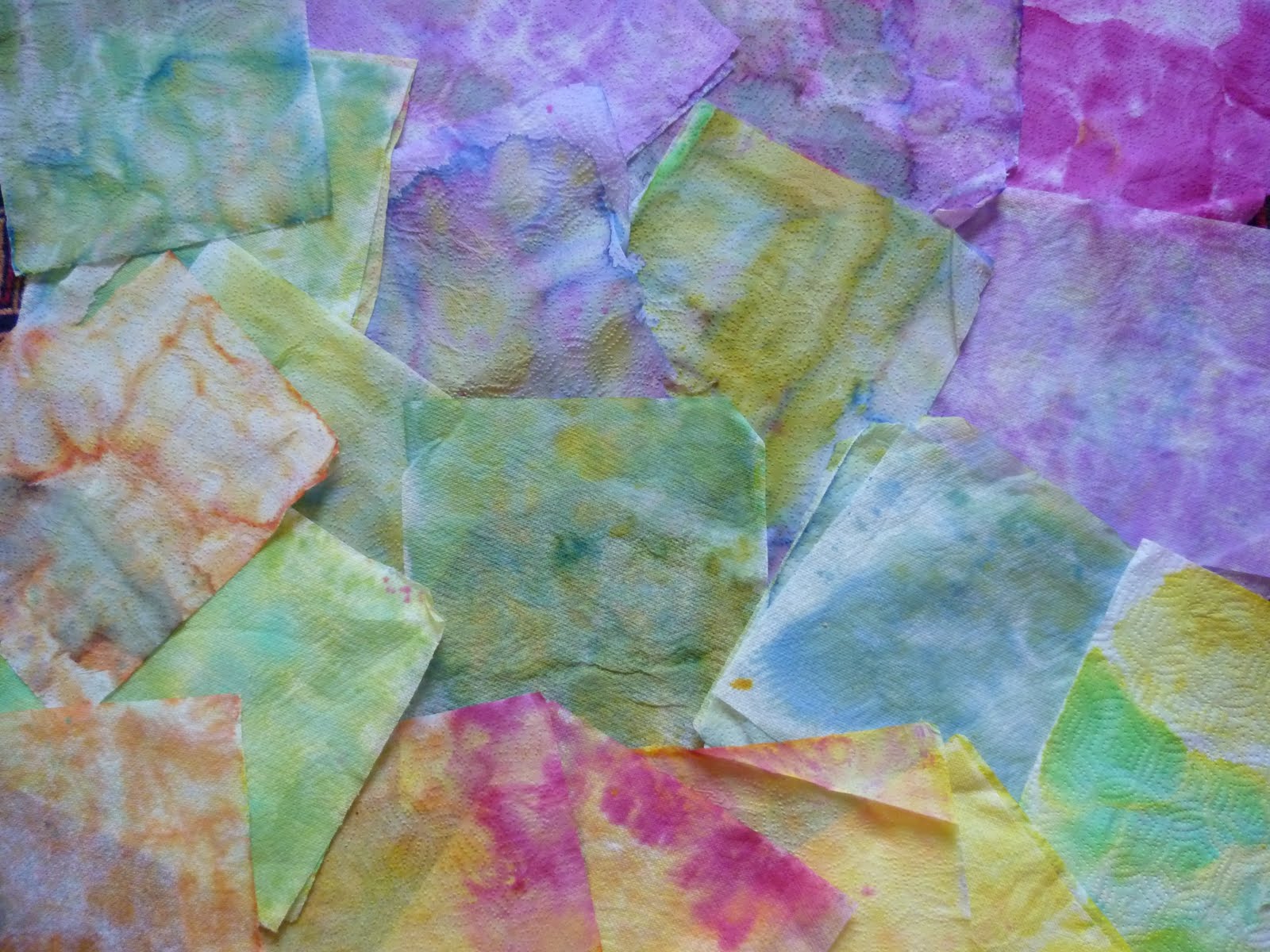 2
2 3
3 4
4 5
5